Call-to-action (CTA) buttons subtly guide visitors toward making decisions that matter, whether that’s signing up, purchasing, or learning more. However, not all CTAs are created equal. Let’s talk about A/B testing Webflow, a process for perfecting CTA buttons and helping shape conversion.

Your CTA button is more than just a design element as it is a conversion catalyst. A poorly placed or unattractive button can repel clicks, while a well-designed one can skyrocket engagement.
In short, if you’re not treating your CTA testing as a high-priority element, you’re leaving conversions on the table.
With A/B testing Webflow, the tiniest tweak can yield significant results. Here’s what to experiment with:
CTA button colors evoke emotions. Try bold, contrasting colors to grab attention or calming tones for trust.
“Learn More” or “Get Started Now”? Text tone, length, and action verbs can all influence clicks. Use action-oriented phrases that create urgency or excitement.
Would a rounded button outperform a rectangular one? Test variations in size and shape to optimize visibility and appeal.
Above the fold or below? Experiment with button positioning to ensure it’s intuitive and accessible.
Hover effects or subtle animations can make your CTA pop without overwhelming users.

Optimizing your call-to-action (CTA) buttons is an art and a science. To achieve the best results with A/B testing Webflow, you need to focus on three key areas: mobile usability, accessibility, and strategic testing.
Mobile traffic dominates, so your CTA buttons must be responsive and easy to interact with. Place them where users can quickly tap with their thumbs and ensure they load seamlessly on all devices.
Make your CTAs inclusive by using high-contrast colors and clear, descriptive text. This ensures users with visual impairments can engage with your buttons effectively, enhancing their overall experience.
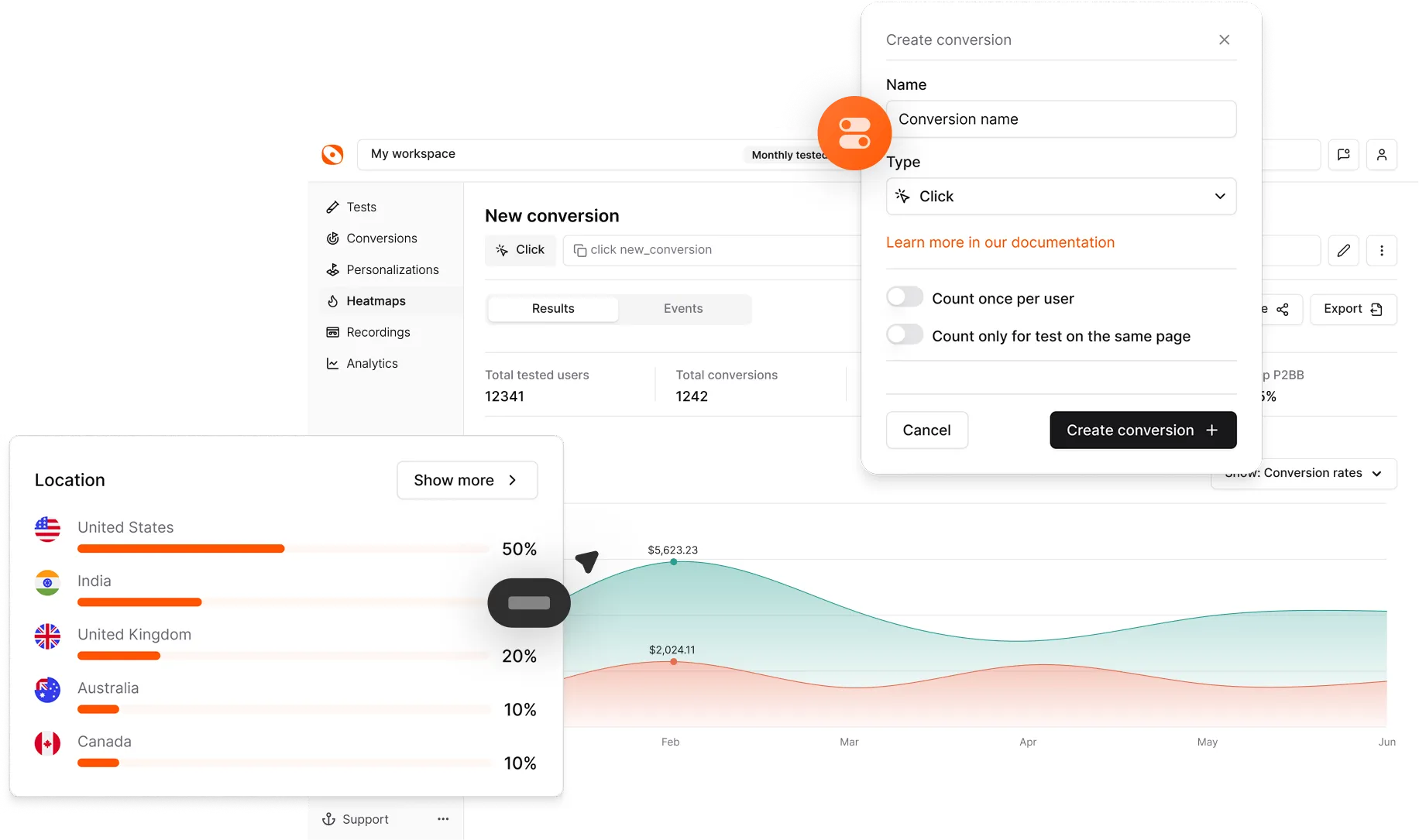
Webflow’s built-in split-testing tools allow you to compare different CTA button variations effortlessly. Test one element at a time, whether it’s the button color, text, or placement.
Want to know what makes your audience click? Setting up CTA tests with A/B testing Webflow can help you uncover what resonates best. By testing variables like button color, text, or placement, you can optimize your calls-to-action for maximum impact.
Here’s a step-by-step guide to get started:
Start by clarifying the action you want users to take, whether it’s boosting click-through rates, increasing sign-ups, or driving purchases.
Use Webflow’s versioning tools to create two variations of your CTA button. Test subtle changes like wording, button size, or placement.
Activate Webflow’s split-testing feature to divide your traffic equally between the two versions for accurate comparisons.
Let the test gather sufficient data before making decisions. Premature conclusions can lead to misleading results, so aim for at least 1-2 weeks of steady traffic.
Optimizing CTA button, used for conversion optimization measures the impact and iterating for improvement. Here’s how to ensure your efforts lead to meaningful results:
Focus on critical indicators like click-through rates, bounce rates, and user engagement. High click-through rates suggest your CTA is compelling, while low bounce rates indicate users are staying engaged after interacting with it.
Use Webflow’s analytics tools to dive deeper into how users interact with your CTA buttons. Identify patterns, such as which version gets the most clicks or where users drop off in the process. This data helps you pinpoint what’s working and what needs adjustment.
Remember, A/B testing is an ongoing process. The insights you gather from one test should inform your next steps. Refine elements like button text, color, or placement, and keep testing to discover what resonates best with your audience.
Optibase is your ultimate partner for seamless website optimization when coupled with A/B testing Webflow. Whether it’s designing high-converting CTA buttons, streamlining workflows, or improving user experience, we create Webflow solutions to your unique business needs.
With our expertise, you can say goodbye to clunky processes and hello to a sleek, efficient design. From setup to ongoing optimization, we handle the heavy lifting so you can focus on what matters most: growing your business.
Can changing button colors really impact conversion optimization?
Yes, changing button colors can significantly impact conversions! Colors influence how users perceive your CTA buttons and the emotions they evoke. For instance, bold, contrasting colors like red or orange are known to grab attention and create urgency, while calming hues such as blue or green foster trust and reliability.
How do I set up button tests in A/B testing Webflow?
Webflow simplifies A/B testing for CTA buttons. Start by duplicating the button or the section where it appears. Make one specific change, such as the button’s color, text, or size, to create two variations. Next, activate Webflow’s split-testing feature to direct traffic evenly between the two versions. Monitor the performance metrics, such as click-through rates or conversion optimization, to identify the winning version.
How long should I run a CTA testing button
The length of your test depends on your site’s traffic volume. Ideally, you should run a test for 1-2 weeks or until you have statistically significant results. Avoid concluding tests prematurely, as small sample sizes can produce unreliable outcomes.