A/B testing is an experimentation process that you run on your web page to determine which of two versions of an asset (A vs. B) performs better — whether that's specific elements, copy, design, or entire pages. It is a core testing method used across digital marketing to optimize everything from landing pages to email subject lines.
This test tells you which variation works better for your audience based on statistical analysis. A/B testing eliminates the guessing — by running these tests on your website, you can make data driven decisions to optimize properly and increase conversions. Rather than relying on a hunch, you collect data from real users and let the numbers guide your next move.
At its core, A/B testing follows the scientific method: you observe a problem, form a test hypothesis, run an experiment by showing two variations to visitors, and analyze the results to draw conclusions. Whether you are optimizing a home page, a product page, or a paid marketing campaign, the principles remain the same.
A/B testing is one of the most powerful tools in conversion rate optimization (CRO). It helps teams make improvements that are backed by statistically significant results, reducing the risk of changes that hurt performance. Combined with the right analytics tools — like Google Analytics, heatmaps, or session recordings — it provides the existing data you need to improve conversion rates across your entire site.
Disclaimer: In this A/B testing guide, we recommend that you use Optibase because it integrates natively with Webflow. But no matter what tool you choose for testing, this guide will still help you set up tests on your website.
TL;DR: An A/B test is comparing the same page with a small difference (i.e., button color), and a split test is comparing two versions of a page entirely. A multivariate test runs multiple combinations at the same time, with the end goal of finding the best combo of variants.
An A/B test or split test is an experiment where you show two variants to users randomly. With statistical analysis, the tool determines which variation performs better depending on your conversion goal.
There are a few ways to run a test on your website, depending on what you want to test different elements or pages:
In an A/B test, you change just one element on your site. This could be a button, parts of text, an image, or a form (for example, you might make the button a different color or make the text larger). When people visit your web page, they randomly see one of these variants, also known as a control version and a new version. The goal is to see which change makes people take a desired action, like buying something or signing up. These are conversions and they determine which variant performs better.
A split test (also called a split URL test) is more extensive. Here you change a whole page and serve each version at a different URL.
You might make bigger changes, like the layout, the colors, or even where certain elements are placed. Site visitors are randomly directed to one of these whole page layouts using a 302 redirect.
The goal here is to see which big changes lead people to take important actions more often, like clicking a button or signing up. These are called conversions, and they determine which variant performs better.
Split URL testing is ideal when you want to compare different layouts, entirely different content, or a completely redesigned landing page against your control page. Because each variant lives at its own URL, split URL tests let you make major structural changes without affecting the original version. A split URL test requires enough website traffic to split between the pages, so it works best for higher traffic pages.
A multivariate test (MVT) is the most advanced form of website experimentation. Unlike a standard A/B test that changes one element at a time, multivariate testing allows you to test multiple elements simultaneously to find the best combination.
For example, you can test combinations of headlines, descriptions, product videos, and call to action buttons — all at the same time. Site visitors are randomly directed to one of these page variants. The goal is to determine which combination of multiple variables works best for your audience and drives the most conversions.
Multivariate testing is best suited for pages with higher traffic (ideally thousands of daily visitors) because you need a large enough sample size to reach statistical significance across all combinations. If you are just starting out or your site does not have sufficient traffic, start with simpler A/B tests first and work your way up.
By showing these tests to your website visitors, you save a lot of time and resources. And if you’re not A/B testing your website, you’re surely losing out on a lot of potential business revenue.
This is how an A/B test works in the most simplest form:
There are many benefits for businesses that are implementing A/B testing. Let’s break it down:
The cost of acquiring quality traffic on your site is huge. A/B testing lets you make the most of your existing traffic without having to spend additional money on acquiring new traffic.
By testing different variations and showing them to your website visitors, you can optimize continuously to improve the user experience and increase conversion rate. Sometimes even the smallest changes on your web page can give you high ROI (for example, changing the CTA). This directly reduces your customer acquisition costs because you are getting more value from the existing traffic you already have, no additional ad spend required.
Visitors end up on your website to achieve a specific goal. It may be to learn more about your product or service, buy something, sign up or to simply browse. But whatever the visitor’s goal may be, they might face some common pain points while doing that. It can be a copy that’s too complex or a CTA button that’s hard to find.
Not being able to complete their goals leads to bad user experience, directly impacting your conversion rates. If you put that to the test with two variations, you can quickly fix their pain points before it's too late. The data you collect shows exactly where visitors drop off, so you can make targeted data driven decisions rather than guessing.
One of the most important metrics to track on your website is the bounce rate. It can come from a lot of different things, like too many options to choose from, confusing navigation, complex copy, hard to find CTA buttons, website not being what they expected it to be, and so on.
Since different websites address different audiences, there is no ultimate solution for all to reduce bounce rates - but running an A/B test can be beneficial. With A/B testing, you can test multiple variations on your site until you find the version with the lowest bounce rate. This not only helps you find traction and fix visitor pain points, but also helps improve their overall experience and user engagement. If your site visitors are happy, they'll more likely convert into a paying customer. Understanding visitor behavior through testing is essential to reducing churn on your web page.
By testing your website with A/B tests, you can make minor changes instead of getting the entire page redesigned - which would be usually the case if the existing one is not performing well. By making smaller changes backed by data, you reduce the risk of jeopardizing current conversion rates.
A/B testing lets you focus your resources for maximum output with minor modifications. For example, you can just change the copy a little bit and see how people react to it. You would be surprised how even the smallest changes can positively impact the ROI.
You can also try it out before implementing a new feature. Before you show it to all users, A/B test it to understand how a portion of your audience reacts to it. Making changes on your website without testing may or may not pay off in the long run. But testing and then making changes can make the outcome a lot more predictable and deliver reliable results.
Since A/B testing is completely data-driven with no room for guesswork or gut feelings, you can quickly determine a “winner” and a “loser” based on your data. The metrics are for example time spent on the page, number of demo calls, click-through rate, and so on.
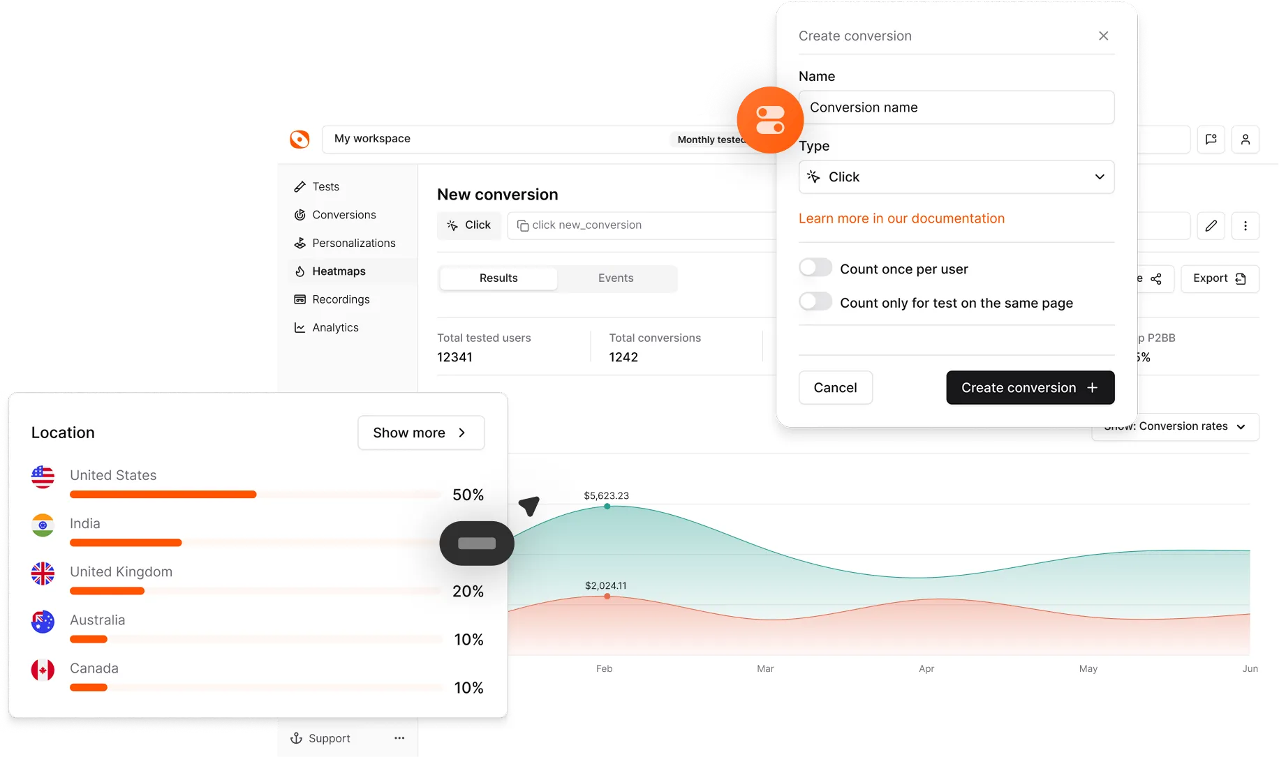
For this purpose, Optibase uses the Probability to Be Best (P2BB) measure. It’s a statistical measure used in A/B testing to evaluate the likelihood that a particular variant (A vs. B) is the most effective based on collected data. It’s calculated using Bayesian statistics, which consider the observed results and the uncertainty inherent in testing.
How to read P2BB:
By relying on statistical data and performance data, you reduce all risk factors connected to your subjective assessment. This is what separates data driven organizations from those that rely on opinion. A/B testing provides the actionable insights needed for decision making at every level.
When to determine a winner:
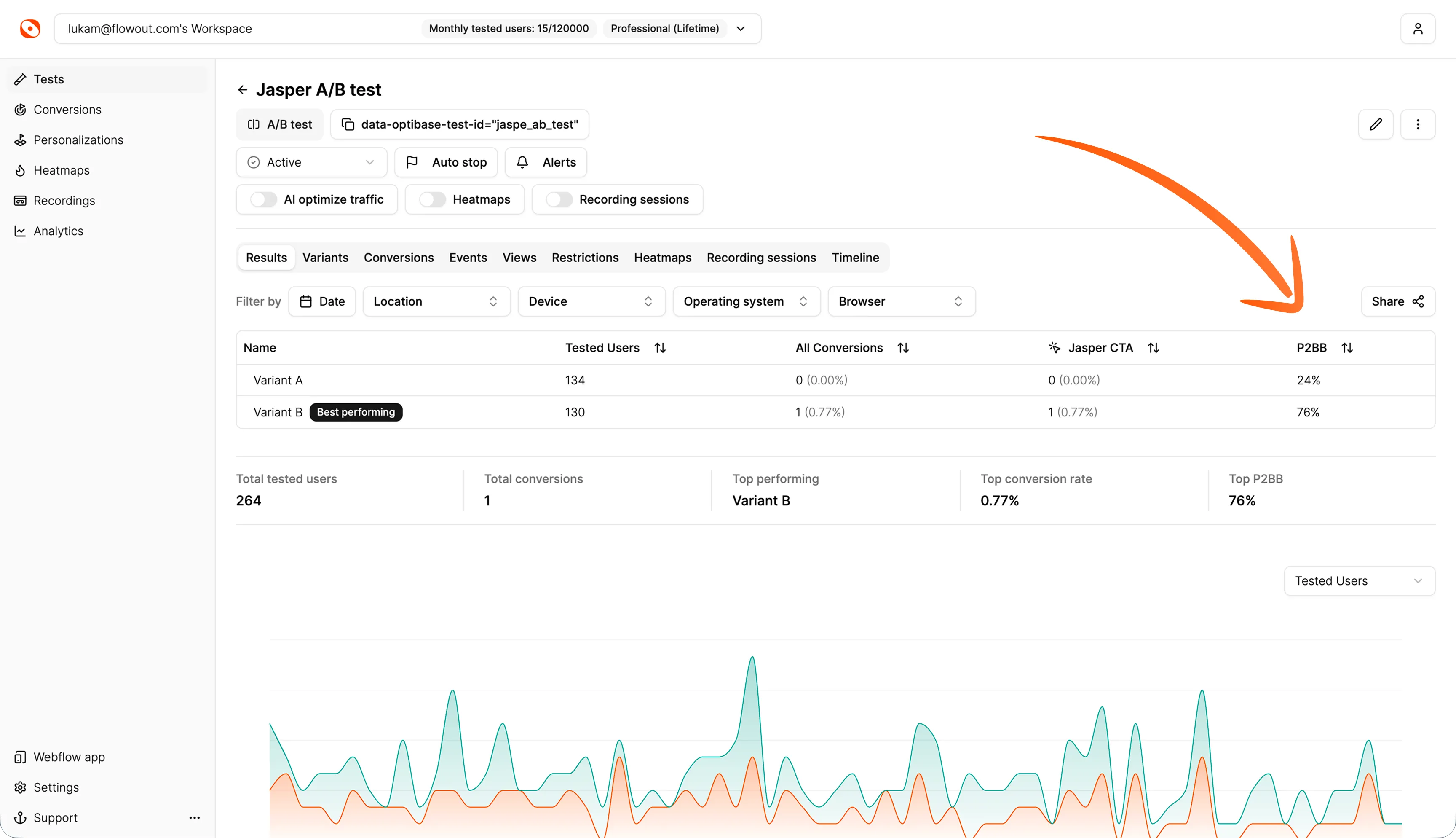
Here’s an example from an active A/B CTA test:
By taking all that into account, you will be able to answer questions like this with confidence:
Your website’s conversion rates usually determine the fate of your business or your product. So in order to maximize conversions, you need to optimize every aspect of your page for your target audience.
Here are some of the most common elements to A/B test:
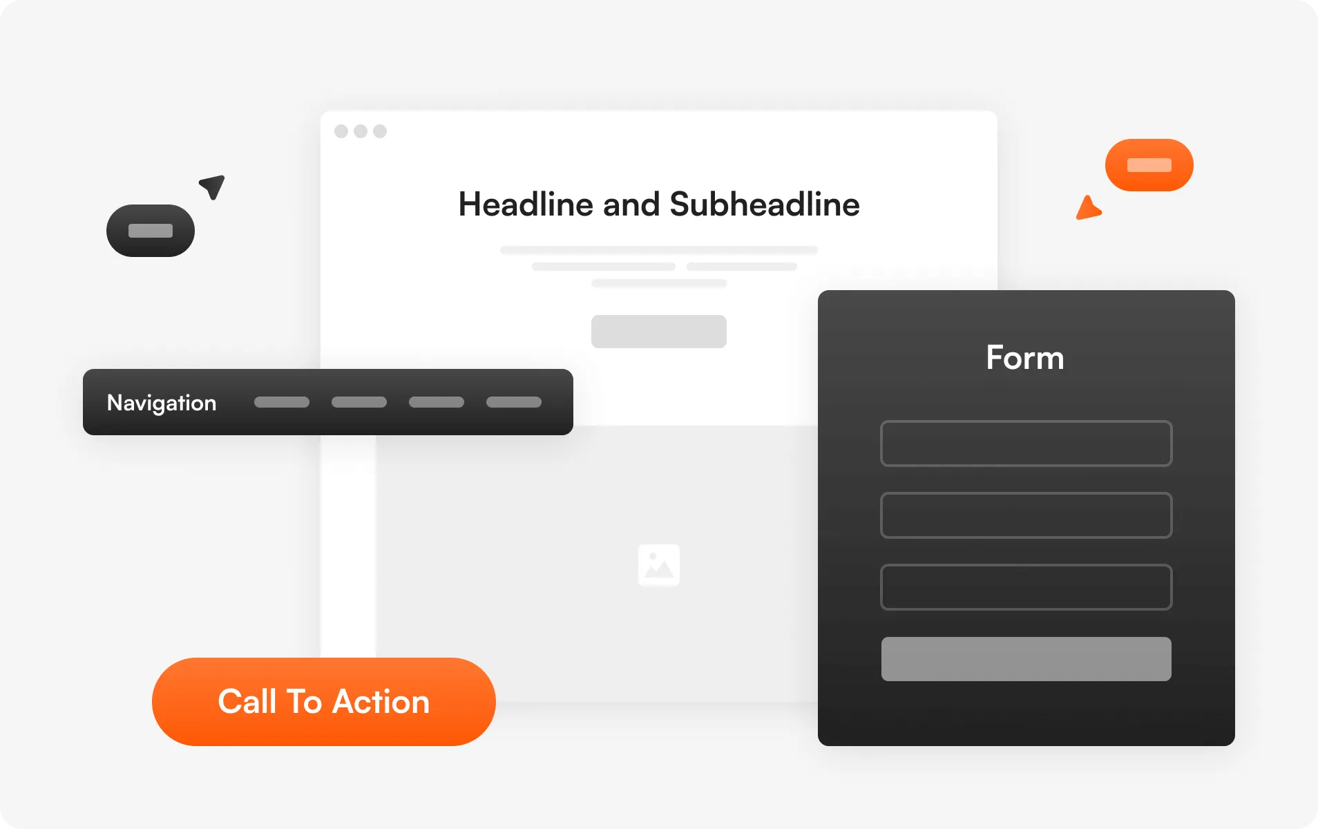
A headline is the first thing a visitor notices on your website. It can break or make your site. It’s what defines the first and last impression, playing an important role in whether or not they’ll go ahead and convert into paying customers.
By running A/B tests, you can test practically anything on your website or customer journey. From individual page elements to entire landing pages, pop ups, product pages, and even email campaigns.
Headlines need to be short, straight to the point and catchy. Don’t overcomplicate and make them complex. They need to deliver the message in the first few seconds and tell the site visitor exactly what to expect.
Quick tip: Ideally, your headings should finish the sentence ‘I want to _______’, from the standpoint of your customers. For example: “I want to boost conversion rates with A/B testing’
The body of your website should clearly explain what the visitor should expect. It should also support the messaging in your page’s headline and subheadline. A well-written body can significantly increase the chances of turning your website into a conversion magnet.
Here are some quick tips for drafting your website’s content:
Quick tip: The majority of your users aren’t actually reading most of your body text - but the ones that are, typically just finished reading the heading above it. Ensure your body copy ‘explains’ the header copy above it. Using our previous example of “Boost conversion rates with A/B testing”, a good body text could be “Install Optibase on your site in 2 minutes and start running tests with a 14-day free trial - no credit card required.”
You can try A/B testing a few copies with different fonts and writing styles, then analyze which catches your visitors' attention the most. Try testing the length, tone, and specificity of your headlines.
Because every element on your website seems so crucial, businesses sometimes struggle with finding what to keep and what to get rid of. With A/B testing, this problem can be easily solved so you can improve conversions.
For example, as a SAAS business, your landing page is the most important from a conversion perspective. Your potential customers want to get information about what you’re offering fast and then have an easy way of signing up if they’re interested. So for SaaS businesses, testing different design options and layouts makes the most sense.
You could test your landing page with a short product demo and then without it. You can try how the CTA button works in the middle of your page, and then one version with a signup button in the top right corner only. You can also test if the version with two CTA buttons (one at the top and one at the bottom) works better than the version with just one main CTA button. Try testing different layouts to see which page layouts drive the most form submissions and sign-ups. You could test a single page layout against a multi-step layout for your sign-up flow.
Another important element of your website that you can optimize is the navigation menu. It’s the most crucial element when we’re talking about user experience. Make sure you have a clear plan for your website’s structure and how different pages will be linked to each other - the flow has to be intuitive.
Some common ideas how navigation usually works best:
Quick tip: For SaaS businesses, you should almost always have “Pricing” in your nav - without it, users are likely to bounce (but as always, run an A/B test to confirm).
Forms are how your potential customers get in touch with you. And they become even more important if they are a part of your purchase funnel. Just as no two websites are the same, no two forms addressing different audiences are the same.
For some businesses, small forms might work the best, but long forms may do wonders for other businesses. You can figure out what works best for you easily by running A/B tests on different types of forms — short and long, mandatory information you collect, and the number of form fields you include. Test whether reducing form fields increases form submissions, or whether adding more fields improves lead quality. For example, requiring a company name might reduce total submissions but increase the quality of leads that come through. You should also test the placement of forms on your landing pages — pop up forms versus embedded forms can produce very different results.
Consider testing different page layouts for your home page, product pages, and key landing pages separately — what works on one may not work on another. You can also experiment with visual elements like images, icons, and spacing. The possibilities of improving your conversion rates are endless.
The CTA is where all the action takes place - whether or not your visitors convert, if they fill out the signup form or not and other actions that have a direct impact on your conversion rate. A/B testing enables you to test different CTA copies, their placement, size and color, and so on.
Social proof may show in the form of recommendations and reviews from your customers or experts in the field, or as testimonials, awards, certificates, and so on. The mere presence of these real people validates your claims on the website.
With A/B testing, you can determine whether or not adding social proof is a good idea, or where it works the best - at the beginning of your customer journey or somewhere in between. It also tells you what kind of social proof will get you more conversions - whether that’s certifications or personal recommendations from other founders.
Quick tip: Start with the assumption that more social proof = more conversions. While this is not always true, from my experience, it usually is - so I’d recommend adding more social proof to your site initially, and then A/B test removing them 1 by 1.
Some website visitors will prefer reading long-form content that goes in-depth about what you do, while others will only skim the landing page and jump to conclusions. Those prefer short-form content that gets straight to the point.
With A/B testing, you can determine which type of content your audience prefers. It can be done easily, by creating two pieces of the same content - but one should be significantly longer than the other, with more details. Analyze which compels your readers the most.
Keep in mind that content depth also has an effect on SEO. If conversion rates are similar, you’ll likely be better off with more text. You can also experiment with having both long and short versions of content on your page in different tabs! Additionally, test dynamic content that changes based on the visitor — for example, showing different content to new visitors versus return visitors. Testing content depth is especially important on landing pages where the right balance of information can significantly improve performance.
By experimenting with different positions and types of your call to action buttons and other elements, you will be able to understand which variation has the potential to get you the most conversions. Test your CTA copy — for example, "Start Free Trial" versus "Get Started" versus "See It In Action." You can also A/B test the call to action in the context of social media ads and email campaigns to optimize your entire funnel, not just your website.
A/B testing offers a very simple way of finding out what works and what doesn’t work in any given marketing campaign. As traffic acquisition becomes more difficult and expensive, it’s important that you offer the best possible experience to the visitors who come to your website.
This will help them achieve their goals and allow them to convert in the most efficient way possible. A/B testing allows you to make the most out of your existing traffic and increase conversions.
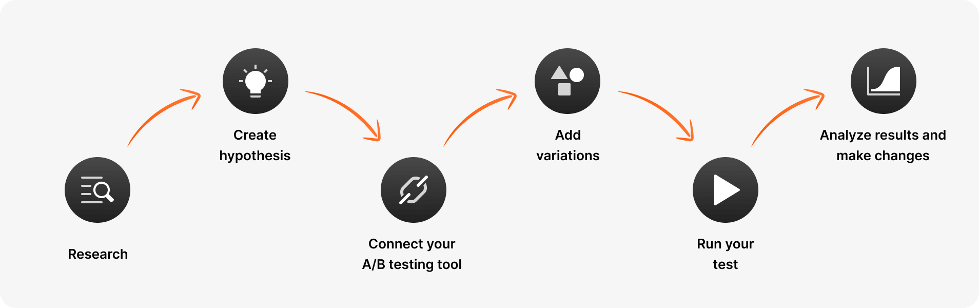
Before coming up with your A/B testing plan, you need to first research how your web page is currently performing. If you've already been tracking your analytics with analytics tools like Google Analytics, PostHog, FullStory, or Webflow Analyze, you're almost done this step — just take a look at the existing data and determine which pages you're going to be testing.
If you haven't been tracking anything yet, I'd recommend installing one of these tools and starting to collect data before you begin. Google Analytics in particular is free and provides detailed insights into user behavior, visitor behavior, bounce rate, click through rate, and more.
You should check how many users are coming to your pages, which pages drive the most traffic, the various conversion goals of different pages, and so on. Look at your performance data to understand where visitors are dropping off and which pages have the highest potential for improvement. You should prioritize pages that have the highest potential or the highest daily traffic, so you will be able to test more efficiently. Data analysis at this stage sets the foundation for everything that follows.
If you don't clearly specify goals, you won't know if your A/B tests are actually working towards achieving your business goals. Your test hypothesis should follow a clear format based on the scientific method: "Based on [observation from existing data], we believe that [change] will [expected outcome], which we will measure by [metric]."
The hypothesis can be more complex and longer, or a simple one like "Changing CTA button size will increase conversion rate by 2% on the landing page." If you're not sure where to start, an A/B testing ideas library can help you generate testable hypotheses based on real-world experiments.
A strong test hypothesis should be specific, measurable, and tied to clearly defined goals. It should also be something that can be proven wrong — if your hypothesis cannot fail, it is not a real experiment. Think about what primary metrics you will track, what constitutes a meaningful result, and what the expected outcome looks like if your hypothesis is correct. Document everything — it helps when reviewing past experiments and planning new tests.
There are plenty of A/B testing tools out there, and all have their own pros and cons. As a Webflow agency, we built Optibase due to our frustrations with existing options on the market, and we highly recommend you check it out.
If you’re using Webflow, Optibase has a Webflow app that offers a native way to set up A/B tests and split tests in the Webflow Designer within minutes without impacting your website loading performance.
There are two different ways to connect your A/B testing tool to Webflow.
And that’s it, your Optibase app is set up in Webflow. You should be ready now to start A/B testing different elements on your page.
Before coming up with your A/B testing plan, you need to first research how your web page is currently performing. If you've already been tracking your analytics with analytics tools like Google Analytics, PostHog, FullStory, or Webflow Analyze, you're almost done this step — just take a look at the existing data and determine which pages you're going to be testing.
If you haven't been tracking anything yet, I'd recommend installing one of these tools and starting to collect data before you begin. Google Analytics in particular is free and provides detailed insights into user behavior, visitor behavior, bounce rate, click through rate, and more.
Now that your tool is connected to Webflow, you can start testing. But keep in mind that if you end up using any other 3rd-party solution, you will have to constantly navigate between Webflow and their tool, which could be a nuisance.
You should check how many users are coming to your pages, which pages drive the most traffic, the various conversion goals of different pages, and so on. Look at your performance data to understand where visitors are dropping off and which pages have the highest potential for improvement. You should prioritize pages that have the highest potential or the highest daily traffic, so you will be able to test more efficiently. Data analysis at this stage sets the foundation for everything that follows.
The next step after you successfully connect the A/B testing tool is to create a variation based on your hypothesis, and A/B test it against the existing version.
With the Optibase app, you can test anything from specific page elements, to copy and design variations, to complete pages. Depending on how much traffic you’re getting or if you want to run more tests, you will be prompted to upgrade if you reach the limit. But to start, it’s completely free.
For example, you can start light and compare two different headings, and connect conversions to the CTA button. It takes only a few clicks and you can start comparing.
Depending on what you want to test, we offer extensive documentation for Optibase - both web app and the Webflow app. Click here to learn more about it.
Once all variations are set up and you’re ready to finally start A/B testing your website, it’s time to run the test.
Here you should consider a few factors for the test to be successful.
Sample size means the number of visitors, or the amount of traffic you need to accurately run a valid A/B test. When running your A/B test, it's important to have a large enough sample size so you can achieve accurate results that reach statistical significance.
If your sample size is too small, your test results will not be statistically significant or reliable at a high confidence level. In other words, your tests might not be accurate because it's impossible to tell how your entire audience actually behaves if only a few come to your site. The results could be due to random chance rather than a genuine difference between variants.
It depends on the use case, but a general rule of thumb is that you need a minimum of 1,000 visitors and 100 conversions per variant for a highly reliable test. If you want a more precise estimate based on your own traffic and conversion rate, you can use a sample size calculator to determine the appropriate sample size you need to reach statistical significance.
However, the more visitors you are able to test, the more accurate your results will be. While speed is important, so is data integrity, and you'll have to use your own judgement to decide when the best time to end the test is.
Another important factor to consider is the duration of your test. If you will be running your test for just a few days, you won’t be able to gather enough data to make accurate conclusions.
So, when running A/B tests in Webflow, the average recommended testing time is 2 weeks, but you should always identify key factors relevant to your own conversion goals and determine the best length based on that - it could be even longer than 2 weeks, especially if you don’t have enough traffic yet.
If you want help estimating how long your test should run based on your traffic and goals, you can use a test duration calculator to get a clearer recommendation.
This is the last step in your A/B testing campaign, so analyzing results is extremely important. A/B testing is designed for continuous data gathering and constant iterations to improve your conversion rates.
Once your test concludes after a given time, analyze the test results by considering metrics like percentage increase, confidence level, confidence intervals, direct and indirect impact on other metrics, P2BB measure, and so on. Look for statistically significant results — results where the confidence level is at least 95% — to avoid drawing conclusions from false positives or random chance.
After you carefully analyze these numbers and compare them with your goals from before, deploy the winning version and see how your conversions increase. Also keep in mind that A/B testing lets you systematically work through each part of your website to improve it, so make sure you implement it across your entire Webflow build. The data analysis from each test feeds into your next test hypothesis, creating a cycle of continuous improvement.
Here are some helpful tips to improve your A/B testing performance in Webflow:
Once you have tested each element or most elements on your website, revisit each successful as well as failed test. Analyze the results and determine whether there is enough data to justify running another version of the test. For example, you could have a lot more traffic after some time, or you completely changed your headline and it works better now - why not test a different CTA button again?
You should always be cautious of testing too many elements together, but increasing your A/B testing frequency is essential in scaling your results. But make sure to plan the tests so no one affects others or general website performance. One solution to this is by running tests simultaneously on multiple pages of your website or by testing elements on the same web page at different time periods. Having a dedicated testing calendar is useful here. You can also conduct tests on different segments — for example, testing one variation for mobile users and another for desktop visitors — to understand how user behavior varies across devices.
A general rule of thumb, not more than two tests should overlap each other. Do not ever compromise your website’s overall conversion rate because of increasing testing frequency. For example, if you have two or more critical elements to be tested on the same web page (for example, a product video and the main CTA button), space them out. Testing too many elements on the same page together makes it very difficult to determine which element impacted the success or failure of your test the most.
You usually measure your A/B test’s performance based on a single conversion goal to help you find the winning variation. But sometimes, the winning variation can affect other website goals as well. For example, a video on the landing page can reduce bounce rate and increase time spent on site, but also contributes to increased signups. In that case, tracking multiple metrics would be recommended. Common metrics to track alongside your primary metrics include click through rate, form submissions, time spent on page, scroll depth, and bounce rate. By capturing these actionable insights, you build a fuller picture of how each variation impacts user engagement and overall campaign performance.
One of the most effective ways to improve an existing experimentation is to design tests for specific audience segments. If you’re testing your entire audience, then you’re testing the average customer who doesn’t really exist. Obviously, testing each individual isn’t possible - but breaking them into segments is the next best thing. You can start by segmenting the audience based on their geolocation and screen size (desktop vs. mobile). Targeting them will reveal more meaningful insights into their behavior.
While every website is unique, there are established best practices that give you a strong foundation for your tests. Start with changes that are commonly proven to work — like making your call to action buttons more prominent, reducing form fields, adding social proof, or simplifying your navigation elements. These best practices give you a higher chance of a positive impact from your first round of tests. From there, you can move into more creative experiments and iterate based on your test results.
A/B testing is by far one of the easiest and most effective methods to increase your revenue and conversions. However, it demands planning, patience and precision. Making silly mistakes can cost your business time and money.
To help you avoid making some of the most common mistakes related to A/B testing, here’s a list to remember:
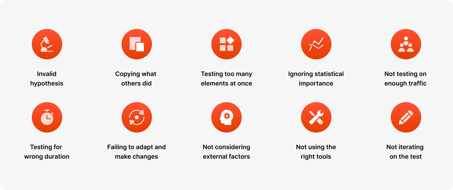
Before you conduct your A/B test, you formulate a hypothesis. All the next steps depend on it. What should be changed, why it should be changed, what the expected outcome is, and so on. So if you start your experiment with the wrong hypothesis, the probability of your test being successful will decrease.
Yeah, someone else changed their signup flow and lifted conversions by 20%. But it’s their test result based on their traffic which is unique, their hypothesis and their business goals. Like mentioned previously, no two websites are the same - what worked for them might not work the same for you. So before you try and copy what worked for others, try to determine if it really makes sense for your case.
Testing too many elements on a website together makes it very difficult if not impossible to pinpoint which element influenced the test’s success or failure the most. The more elements you test, the more traffic you need on that page to justify it. So you should always prioritize tests for successful A/B testing and incorporate them into your planning.
If you put your subjectivity or personal opinions into your hypothesis or into your A/B tests, they will most likely fail. No matter if the test succeeds or fails, you must let it run through its entire course (at least 2 weeks) so that it reaches its statistical significance. Every test will give you valuable insights and help you plan your next tests better.
Statistical significance is what separates a real result from noise. Without it, you might be acting on false positives — changes that appeared to win but actually didn't. Always ensure your results are backed by a high enough confidence level (at least 95%) and that you have reached the appropriate sample size before making any conclusions. You can check this using tools that calculate confidence intervals — these tell you the range of plausible outcomes and help you understand the reliability of your test results.
Every A/B test should be done with the appropriate traffic to get accurate results. A general rule of thumb says that you need at least 1.000 site visitors and 100 conversions per variant, but the more traffic you have, the better test results will be. Using lower traffic than required for A/B testing increases the chances of your campaign failing or producing inconclusive results. If you do not have sufficient traffic on a given page, consider testing on higher traffic pages first, or consolidating traffic from multiple pages to a single page to increase your sample size. You can use a sample size calculator to determine exactly how many visitors you need before starting your experiment.
Based on your website traffic and goals, you need to run A/B tests for a certain length of time to achieve statistical significance. The general rule of thumb is at least 2 weeks, but it can be longer depending on your goals. Running a test for too long or too short a period can result in the test failing or producing wrong results. For example, because one variant of your appears to be winning after the first few days, that does not mean that you should call it off before and declare a winner.
A/B testing is an iterative process, with each test building upon the results of your previous tests. Businesses give up on A/B testing after their first test fails, but what you should really do instead is learn from previous tests and use these insights in the future. Do not stop testing after your first test, no matter the results. Test each element repetitively to find the most optimized version for your target audience.
You should run all of your tests in comparable periods to get the most accurate results. For example, you can’t compare your highest website traffic with the days when you have the lowest website traffic (due to holidays, weekends, and so on), and draw conclusions from that alone. That’s why it’s also important to run your A/B tests for a longer period of time, to increase your chances for a successful test.
A/B testing is definitely gaining popularity, and that means multiple new tools on the market. Not all of these tools are equally good. Some tools will drastically slow down your site (especially if you have to install multiple scripts), some are not closely integrated with Webflow and can cause your website harm and data deterioration. A/B testing with faulty tools can risk your test’s success from the start, so make sure to use recommended tools.
Running a single A/B test and moving on is a missed opportunity. Even when a test produces a clear winner, it should rarely be considered “done.” Each result gives you new insights into user behavior that can be used to refine the next variation. Teams often stop after one successful test instead of building on what they’ve learned. A/B testing works best as a continuous process where each iteration brings you closer to an optimized experience for your audience. Think of it as a research method: every test generates new performance data and actionable insights that fuel the next round of experiments. The most successful teams are always running more tests, building on what they learned to achieve better results over time. The goal is not just to find a winning variation — it is to build a culture of experimentation that drives data driven decisions at every level.
There won’t be any negative impacts on your Google rankings as long as you’re using tools that follow the recommended guidelines. Google explains in their article what you need to watch out for, and we’ll summarize the important parts here.
Cloaking is when you show one variant of content to humans, and a different variant to Googlebot. This is against the Webmaster Guidelines and you should not do it - you risk being removed from Google rankings. This would only happen if you play with the script yourself, not as part of a tool like Optibase, so if you run your tests normally then there’s nothing to worry about.
If you’re running an A/B test that redirects visitors from the original URL to a variation URL, use a 302 (temporary) redirect, not a 301 (permanent) redirect. This will tell the search engines that your redirect is temporary for the time being. JavaScript-based redirects are also approved by Google.
The time you will need to run your test varies depending on factors like your conversion rates, and how much traffic your website gets. A good A/B testing tool will tell you when you’ve gathered enough data to be able to draw accurate conclusions (in case of Optibase, this is measured as “95% Confidence”). Once your tests are concluded, you should update your site with the “winner variations” and remove all elements of the test as soon as possible.
A/B testing is simple in theory, but it helps to see what it looks like in real life. Below are three examples from Optibase customers, showing what they tested, why it mattered, and what changed once the data was in.
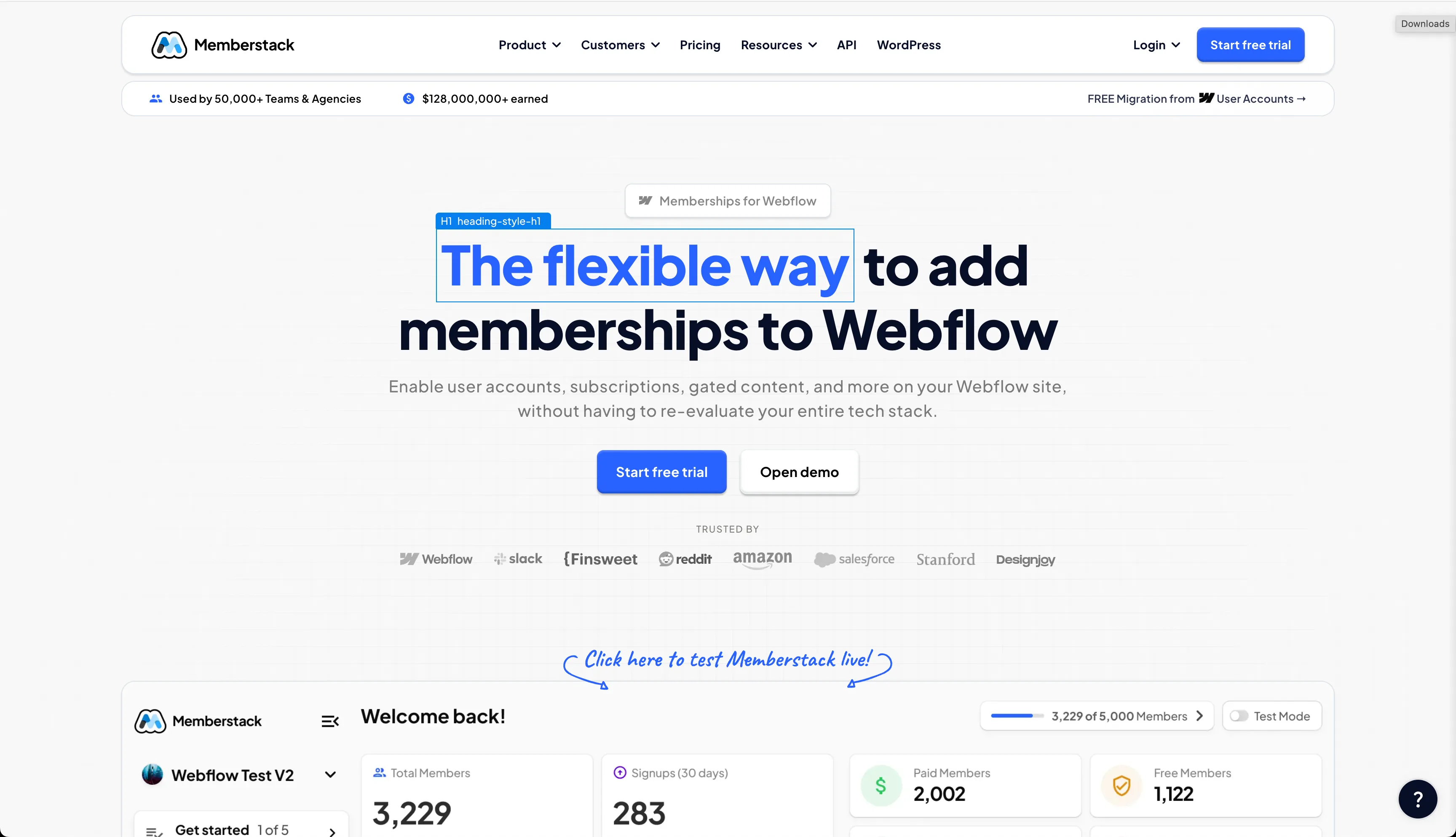
Memberstack, a platform that helps teams build member-only experiences on Webflow, needed a structured way to improve conversions on their marketing site. They weren’t starting from zero — they already had solid performance — but they wanted a systematic way to know what worked instead of guessing.
To do this, the team used Optibase to run a series of incremental A/B tests on their Webflow pages. Instead of betting everything on one big design overhaul, they tested many smaller hypotheses — from headline tweaks to layout adjustments — and let data reveal what actually drove engagement.
The results were meaningful. Over a short testing period, Memberstack increased their tracked conversion rate from 6% to 8%, representing a 33% relative lift, and this uplift corresponded to an estimated $500,000+ in annual lifetime value impact. These gains came not from a single “magic change” but from layering test wins over time.
What makes this example useful is the pattern: start with small, measurable tests, build confidence with results, then scale your testing program. The lift didn’t come from guesswork — it came from a cycle of hypothesis, measurement, and iteration that you can apply to your own Webflow site
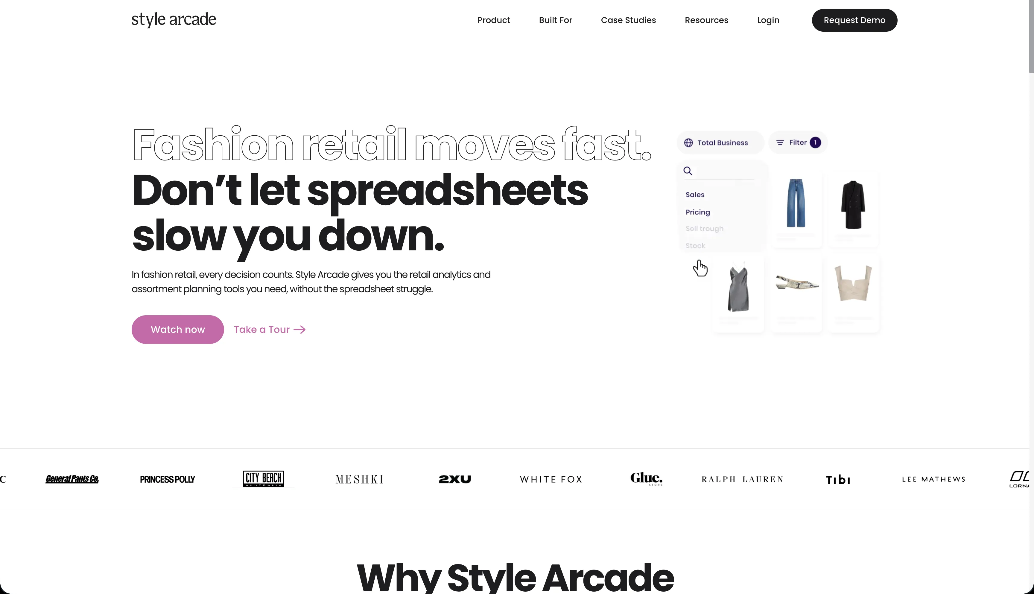
Style Arcade, a SaaS platform for retail and fashion teams, wanted to improve how visitors engaged with their homepage and ultimately increase demo requests. Traffic wasn’t the issue — the challenge was making sure users immediately understood what to do next once they landed on the site.
The team suspected that their call-to-action placement was creating unnecessary friction. Important actions were available, but not prominent enough early in the page. Instead of redesigning the entire homepage, they decided to test a focused hypothesis: would clearer, more visible CTAs improve engagement and conversion without overwhelming visitors?
Using Optibase, Style Arcade A/B tested different CTA placements and prominence in the hero section of their Webflow homepage. One variation introduced a clearer primary CTA higher up the page, while keeping the rest of the layout largely unchanged.
The impact was immediate. Homepage engagement increased from 15% to 37%, and lead-to-demo conversion rate improved from 1.6% to 2.0% — a meaningful lift driven by a single, well-scoped change.
The key lesson from this test is that small visibility changes can unlock disproportionately large results. Before adding more content or complexity, it’s often worth testing whether users can clearly see and understand the primary action you want them to take.
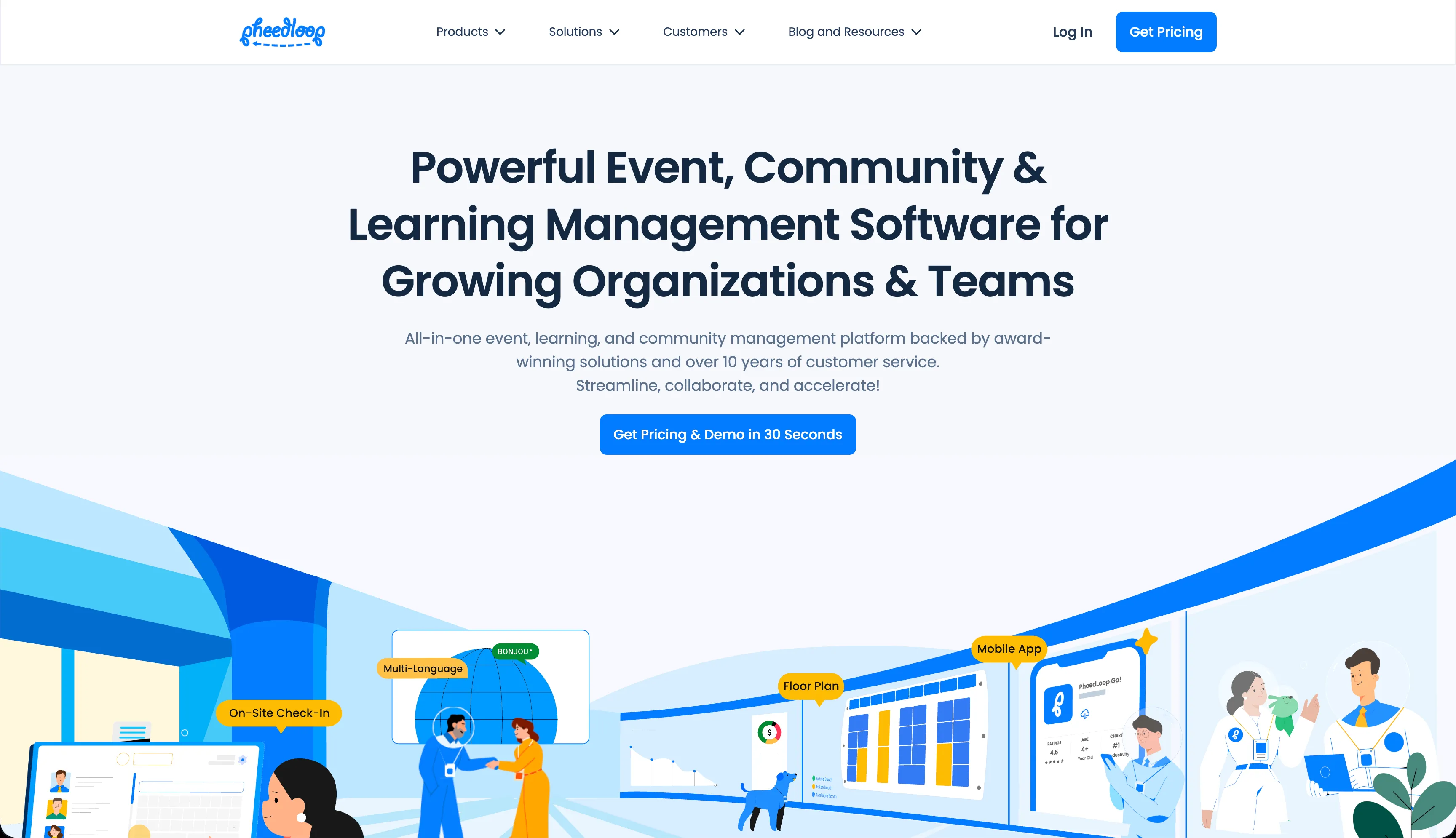
PheedLoop, an event management platform, relied heavily on landing pages to drive leads from paid campaigns. As their marketing efforts scaled, they needed confidence that their landing page experience was converting efficiently — especially before increasing ad spend.
Instead of making assumptions about what layout or structure would work best, the team ran an A/B test comparing two different landing page variants. The changes focused on layout and content structure rather than copy alone, with the goal of making the value proposition clearer and reducing friction for first-time visitors.
The test revealed a clear winner. One variation increased conversion rate from 3.9% to 5.4%, a significant uplift that made paid acquisition more efficient and gave the team confidence to scale campaigns further.
What makes this example especially valuable is the timing of the test. Instead of waiting until performance dropped, PheedLoop used A/B testing proactively — validating what worked before committing more budget. This is a strong reminder that A/B testing isn’t just a recovery tactic, but a tool for responsible growth and risk reduction.
After going through this comprehensive guide on A/B testing, you should now be fully ready to start planning your tests. Although this guide is specific to Webflow, the concepts and terms are general, so it can be used with other tools too.
Follow each step carefully and make sure to keep in mind the recommendations and tips throughout this guide. A/B testing is invaluable when it comes to improving your website’s conversion rates, but you should avoid common mistakes that can impact its performance.
If done with complete dedication and with the knowledge you have now after reading this guide, A/B testing can do wonders for your business. It will also help you improve your website’s pain points by eliminating all weak links and finding the most optimized version for your audience.