A/B Testing Microcopy in Webflow: Small Changes, Big Results

Ever stare at a button and feel completely uninspired? Yeah, your audience probably feels the same. Here's the deal: microcopy, those tiny snippets of text on buttons, forms, or tooltips, might seem insignificant, but they can make or break your website's conversion optimization rates. Fortunately, A/B testing is here to save the day with microcopy in Webflow.

What is microcopy and why is it important?

Let’s start with the basics. Microcopy refers to those short, impactful bits of text that guide users through an experience, say buttons, error messages, tooltips, or form instructions. It’s often overlooked, but in reality, microcopy is your website’s unsung hero for conversion optimization.

Here’s why it matters:

  • Microcopy builds trust: Clear, helpful messaging reduces user frustration.
  • It drives action: Strategic CTAs with optimized text compel users to click.
  • It reduces friction: Thoughtful microcopy minimizes confusion and keeps users moving forward.

Take this A/B testing example: A generic button that says "Sign Up" might convert better if changed to "Join Our Free Community". Why? It highlights value and sets a clearer expectation.

When done right, microcopy can:

  • Increase conversions
  • Reduce bounce rates
  • Improve user experience

The takeaway? Every word counts.

Examples of effective microcopy testing

Real talk: What’s more relatable than a good example? Let’s break down some A/B testing examples that showcase how microcopy changes deliver measurable results.

  1. CTAs: Buttons that speak to users
  • Original: "Learn More"
  • Variant: "Get Started for Free"
  • Result: A 30% lift in clicks. Why? The variant highlights immediacy (start) and value (free).
  1. Form microcopy: Reducing drop-off
  • Original: "Submit" (boring, cold, and vague).
  • Variant: "Send My Application" or "Let’s Do This!"
  • Result: Lower form abandonment. Why? The personalized phrasing feels actionable and human.
  1. Error messages: From frustrating to helpful
  • Original: "Invalid Input."
  • Variant: "Oops! That doesn’t look right. Try entering a valid email (example@domain.com)."
  • Result: Users felt guided, not scolded.

These examples prove that microcopy testing is all about creating emotional connections, reducing anxiety, and driving action.

Tools for microcopy A/B testing in Webflow

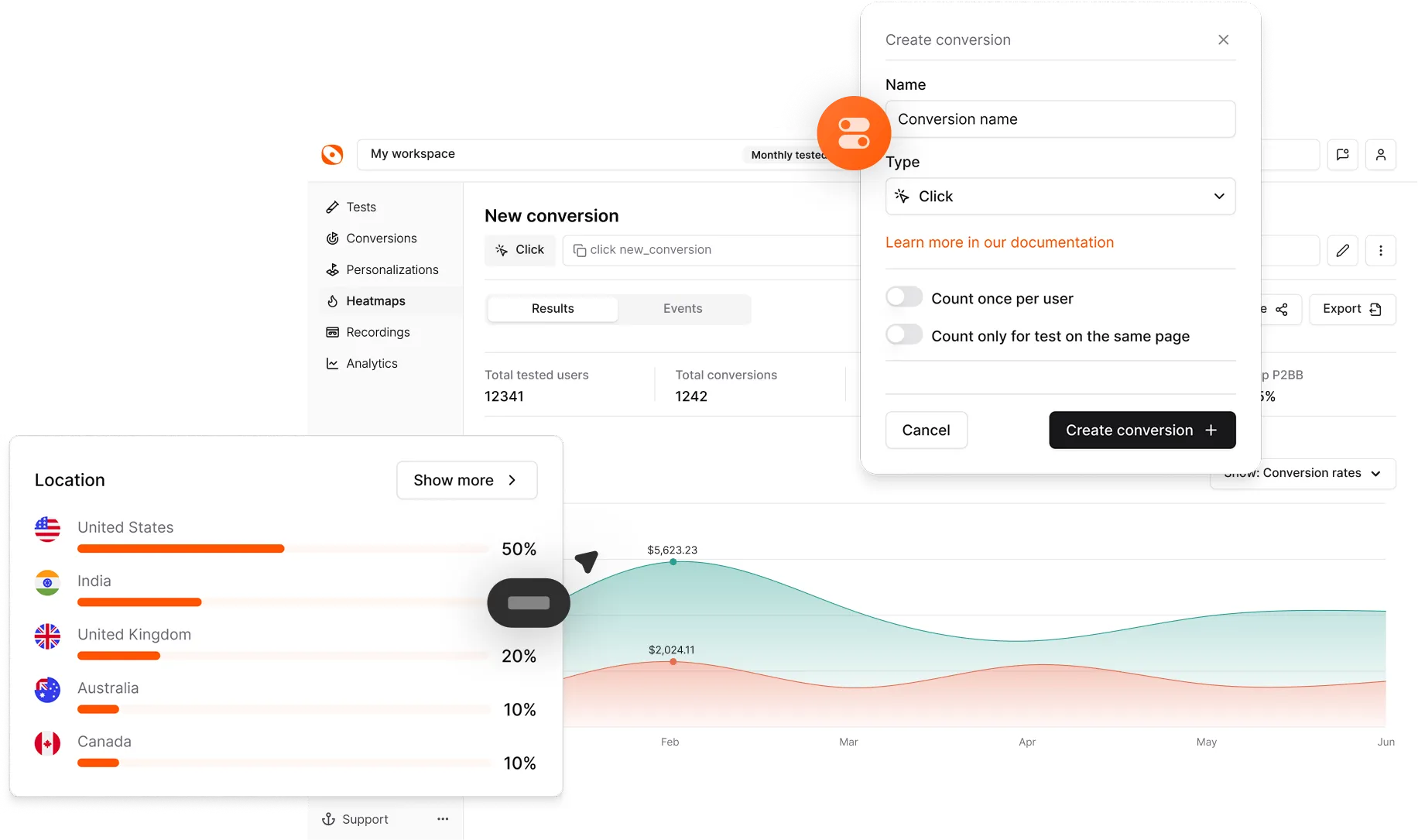
Testing your microcopy doesn’t require a crystal ball. Thankfully, if you’re using Webflow, you’ve got options. Choose your tools wisely, test continuously, and track the results. 

Here are the best tools to nail microcopy testing:

  1. Optibase: If you want to take conversions to the next level, Optibase integrates seamlessly with Webflow. It allows you to test variations of your microcopy and analyze their impact, minus the hassle.
  2. Hotjar: Not strictly for testing, but its heatmaps and user session recordings let you see how people interact with your microcopy.
  3. Optimizely: For startups scaling quickly, Optimizely offers robust A/B testing features for detailed insights into what works.

Measuring the impact of microcopy changes

You’ve tested a microcopy tweak, but now what? It’s not just about CTA optimization at the end of the day. Here’s how to measure the impact of microcopy A/B tests:

  1. Click-through rates (CTR): Are more people clicking that optimized button?
  2. Form submissions: Did more users complete the form after a microcopy change?
  3. Bounce rates: Are users staying longer and interacting more?
  4. Conversion rates: Did the change drive more signups, purchases, or downloads?
  5. User behavior analysis: Tools like heatmaps or session recordings can reveal where microcopy helps (or hinders) user journeys.

For instance, if your CTA "Grab Your Free Trial" boosts conversions by 20% over "Start Trial," you’ve got actionable insights for future optimization.

Best practices for microcopy optimization

A/B testing microcopy isn’t a one-and-done thing. To make the most of your efforts, keep these best practices in mind:

  1. Be specific, not generic: Replace "Submit" with actionable phrases like "Book My Demo" or "Get the Guide."
  2. Speak to your audience: Know your users. Are they casual readers? SaaS customers? Use language that resonates with them.
  3. Focus on value: Highlight the benefit. Instead of "Sign Up," try "Unlock Exclusive Content."
  4. Keep it conversational: Microcopy should sound human and not robotic. A simple tweak from "Invalid Input" to "Whoops! That doesn’t look right" creates a more user-friendly experience.
  5. Test one change at a time: Don’t go overboard. Test small tweaks, like button text or form labels, to pinpoint what’s driving results.

Remember: Words are powerful. Choose wisely.

Small words, big impact

Honestly, microcopy is often overlooked. But it’s the small words that drive the big actions. With the right A/B testing examples, tools, and a clear strategy, you can fine-tune your messaging to connect with users and lift conversions.

Frequently asked questions

What is microcopy testing in the context of Webflow?

Microcopy refers to small pieces of text, such as buttons, tooltips, and error messages, that guide users through a Webflow website. Testing microcopies helps improve clarity, reduce friction, and boost conversions.

How can I test the effectiveness of microscopy?

You can run A/B tests using tools like Optibase or Optimizely. Test variations of your microcopy and track metrics like CTRs, conversions, and bounce rates.

Can microcopy testing changes really improve conversions?

Absolutely! Even small changes, like tweaking button text or improving error messages, can significantly lift conversions and improve user experience.