First impressions are everything. A webpage's design acts as a digital handshake, influencing whether visitors choose to stay or leave. While web design isn’t rocket science, it’s a perfect blend of art and strategy—90% creativity and 10% science. Webflow provides the ideal moment to optimize for conversions, turning data-driven insights into designs that captivate the eye and guide visitors toward action.

Designing for your website is not all about making it look nice but developing an experience for the audiences to feel. The design of your website stands out with some of the highest weight in your website layout and paints the first picture of the kind of brand you have while providing trust cues.
Sources reveal that visitors decide the credibility of a site within 50 milliseconds of their visit. On this level, it involves a quick first impression of the layout, colors, typefaces, and images used. The attractively developed website establishes professionalism, and credibility and ensures the visitors with the relevance of the business, hence increasing the arrival of the second stage of the site usage.
Visual design attracts feelings that are instrumental to choice. Gleaming, bright colors are likely to come with enthusiasm as compared to dull, low-intensity colors that are likely to bring relaxation. That is, certain design elements can influence how viewers feel while subtly nudging them towards a favorable course of action, be it signing up, making a purchase, or browsing additional pages of your website.
A cluttered or poorly designed website may cause the visitor to get lost, which can potentially lead to the decline of trust. On the other hand, a clean and easy-to-comprehend website creates a clear navigation point, which helps users remain on the site.
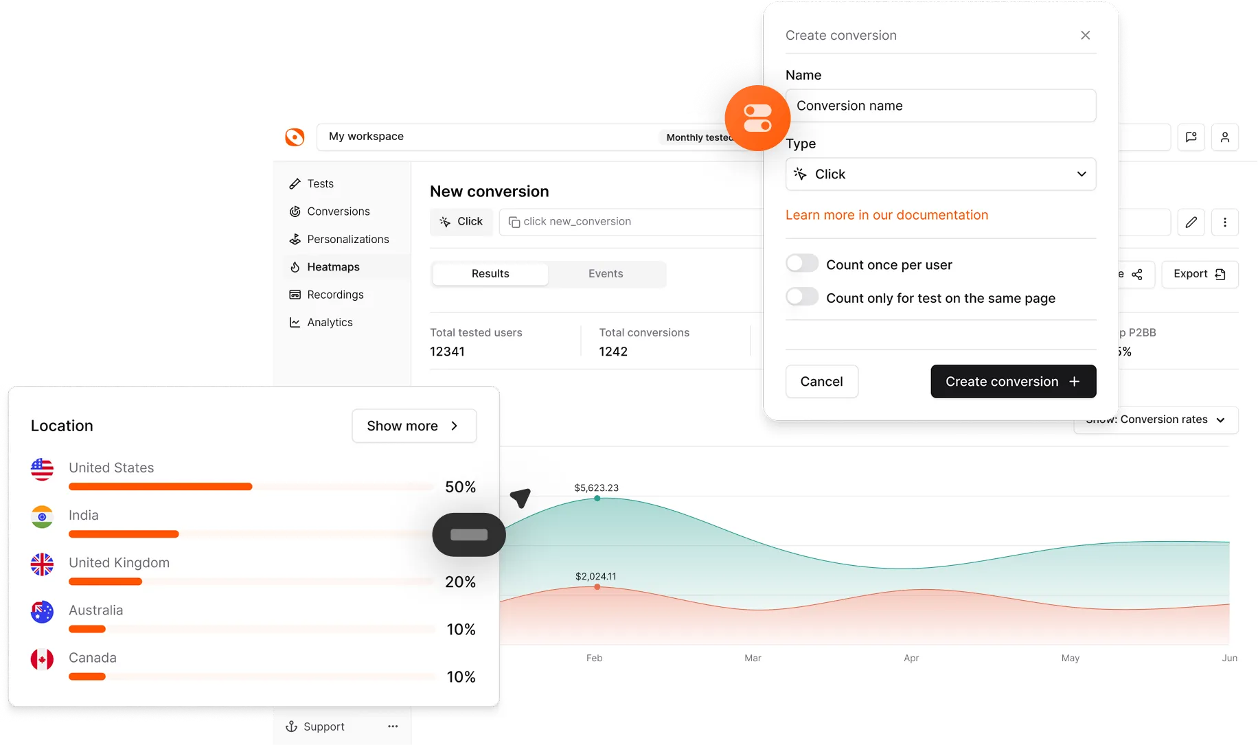
A/B testing design allows you to experiment with different design elements, revealing what resonates best with your audience. Here are the key components of a website design to consider visual design testing:
The headline is often the first thing visitors read. Experiment with:
Visuals create an immediate impression. Test:
The CTA is a crucial conversion element. Experiment with:
The arrangement of elements affects readability and flow. Test:
Typography sets the tone for your message. Test:
Color influences mood and perception. Experiment with:
Webflow offers flexibility in creating and managing A/B tests for visual design elements. Here’s how to get started:
Integrate Optibase with your Webflow site to run A/B tests seamlessly. This tool allows you to:
Tools like Hotjar or Crazy Egg provide valuable insights into user behavior, showing where visitors click, scroll, and linger. Use these insights to identify areas for improvement in your website design.
Google Analytics and similar platforms help track metrics like bounce rates, time on page, and conversions, providing data to support your design decisions.
A successful website design strikes the right balance between aesthetics and functionality. When analyzing A/B test results, consider both qualitative and quantitative metrics:
These include:
Collect direct feedback from users through A/B testing UX. This can provide insights into:
The process of A/B testing is ongoing. You can use the insights to refine your design further, iteratively improving until you get the best out of your design.

With a little bit of systematic testing and refinement through your website's visual design, you’ll be able to make your user experience that much more engaging and effective. Here are the key takeaways:
A/B testing design takes your creativity and uses that to blend with data, knowing your design choices will be both aesthetically pleasing and performance-driven.
Optimized websites not only attract attention but also guide visitors seamlessly through your site, fostering trust and encouraging action.
The absolute objective of A/B testing is to increase conversion rates. One of the most striking sections of a website is the design, and it can really affect your financial success by turning visitors into regular customers.
Design trends and user preferences evolve. Regularly revisiting and testing your website design ensures that your site remains relevant and impactful.
The design is your website’s first and most important impression. By leveraging A/B testing in Webflow, you can transform this critical space into a powerhouse of aesthetics and conversions. Start experimenting today, and let data guide you toward designs that not only look stunning but also deliver results.
What visual design elements can I test in Webflow?
You can test elements like headlines, images, background styles, call-to-action buttons, typography, layouts, and color schemes in Webflow. Each variation helps identify the design choices that resonate best with your audience.
Can A/B testing improve brand perception?
Yes, A/B testing makes sure that your design is preferred by the audience for improved trust and professionalism. Contemplated and visually harmonic designs help increase how users perceive your brand as credible and valuable.
How and where do I prioritize both form and content within testing solutions?
Try to create beautiful-looking designs, all while not sacrificing functionality or ease of understanding. Besides trying to satisfy one aspect of the design, it is crucial to view corresponding metrics and feedback, to balance between form and function.